Employee Financial Platform: Complete Digital Identity & Mobile Experience
When a fintech startup approached me with just an idea and some backend logic, they needed someone to bring their vision to life visually. Their platform would help employees access financial services through a mobile app, but they had no brand identity, no user interface, and no idea how to make complex financial processes feel approachable.
I took on the challenge of creating their entire visual identity and designing an intuitive mobile experience that would make users feel confident about managing their finances.

- Platform: Lead UX/UI & Brand Designer
- Goal: Create a user-friendly, trustworthy financial platform combining employee lending and digital wallet capabilities
- Results: 35+ app screens, brand identity, UX/UI prototype, and style guide
- Status: In development
Role & Responsibilities
I served as the Lead UX/UI and Brand Designer, responsible for translating early business logic into user-centered flows and visual systems. My work covered:
- Defining brand direction and designing the corporate identity
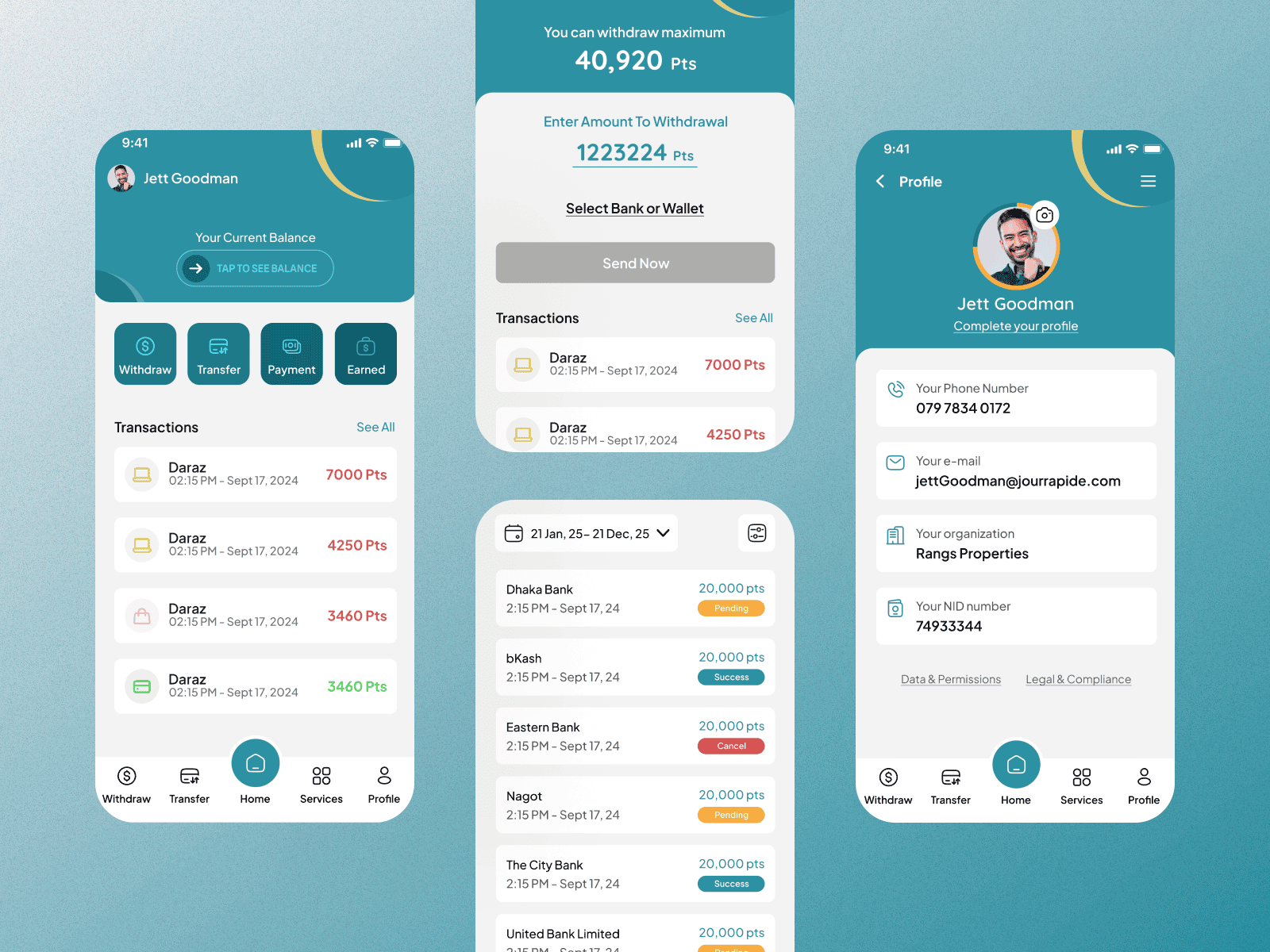
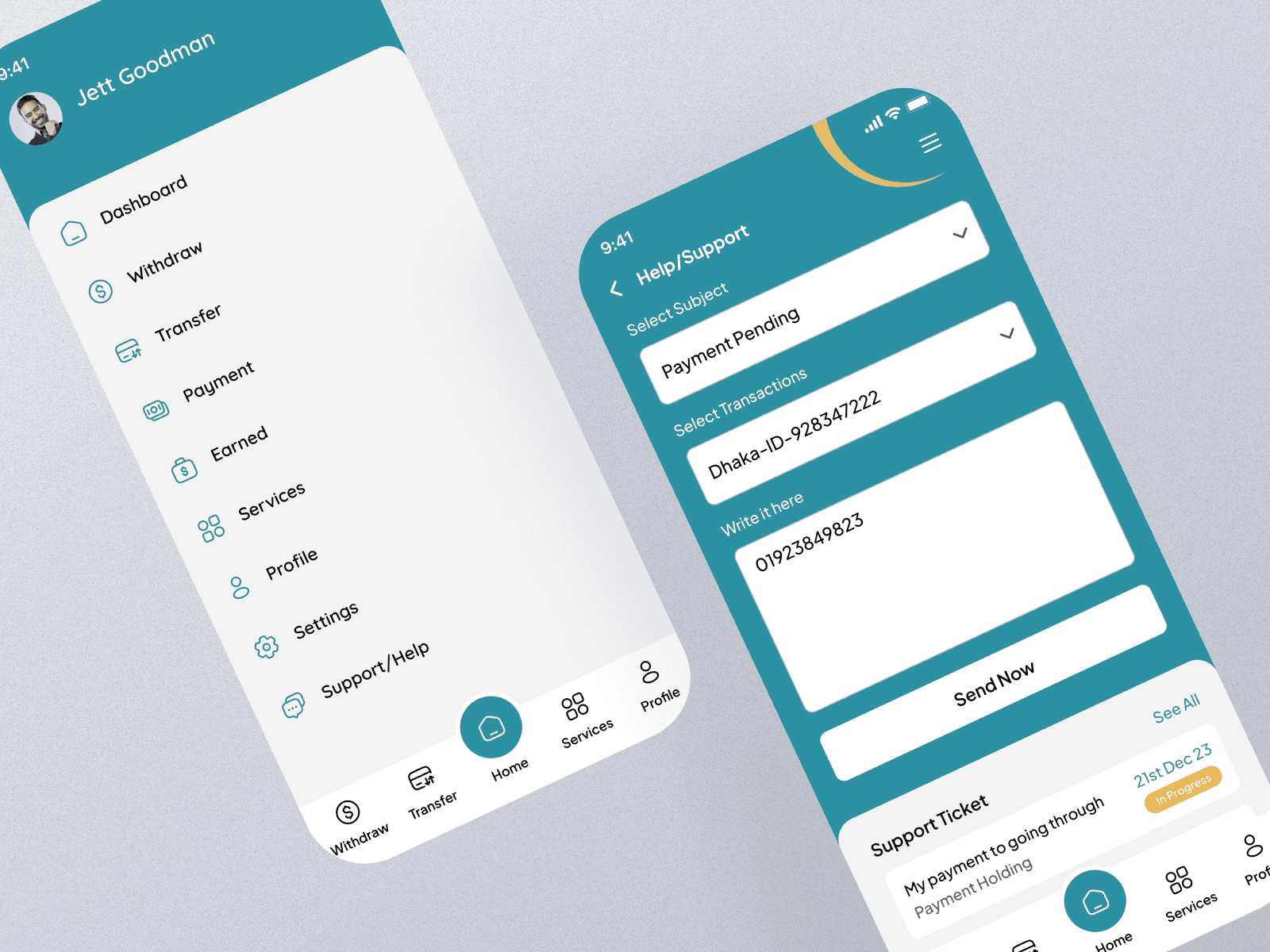
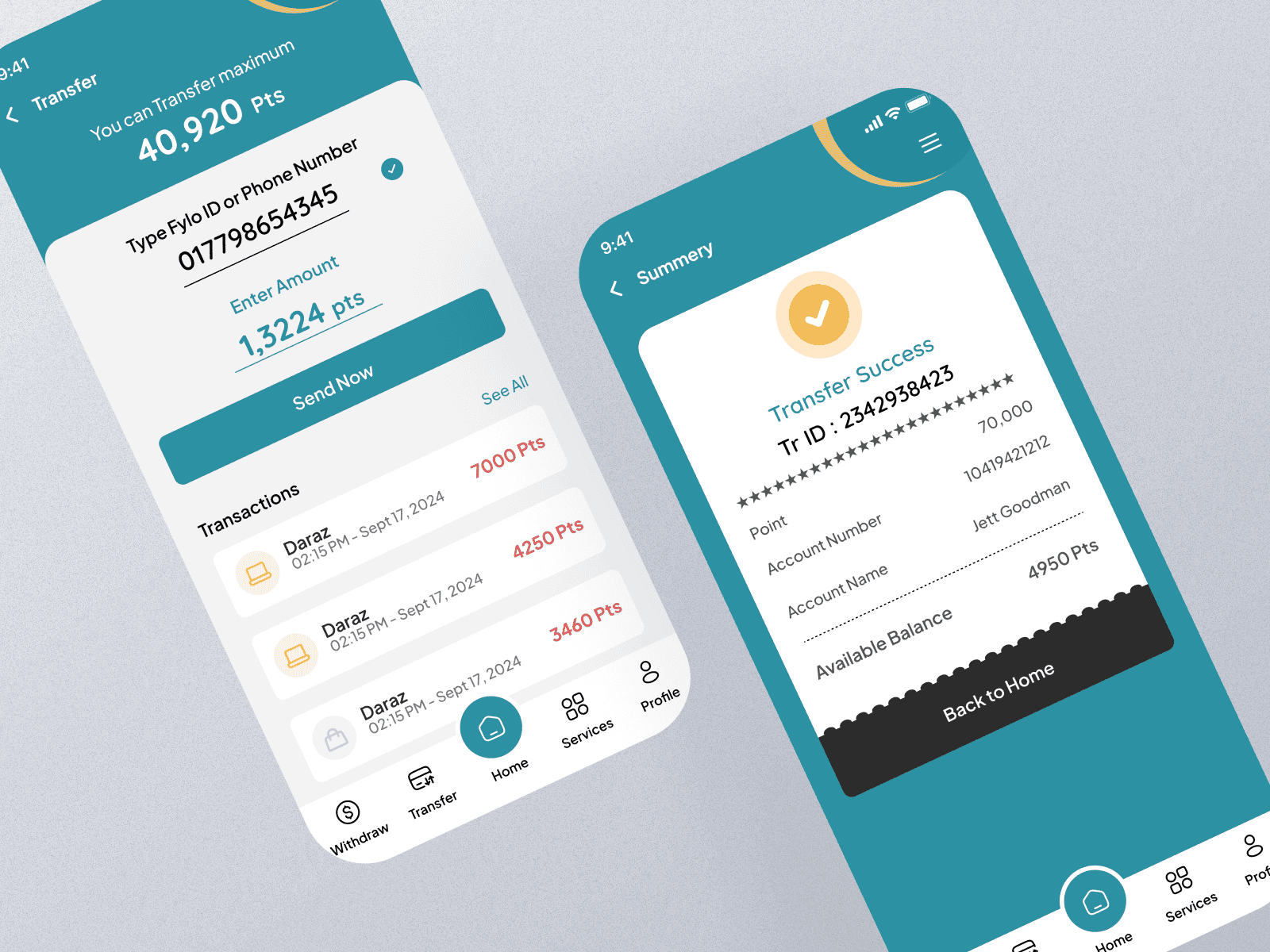
- Designing 35+ mobile app screens from onboarding to repayment tracking
- Creating a component-based design system in Figma for consistency and scalability
- Structuring information architecture and user journeys
- Preparing handoff-ready UI files and documentation for developers
The Challenge
Starting with nothing but a business concept and technical requirements, this startup needed to transform complex financial services into something that felt simple and trustworthy. The biggest challenge wasn’t just making it look good-it was making sure employees would actually feel comfortable using it.
Financial apps can feel intimidating, especially when people are dealing with money stress. I needed to create something that felt more like a helpful friend than a corporate bank.
What They Started With
- A solid business idea for employee financial services
- Backend technology and user flow logic
- Understanding of their target users’ needs
- An existing logo that needed refinement
What They Needed
- A visual identity that built trust and approachability
- Mobile app design that made complex processes feel simple
- A consistent design language across all touchpoints
- Something that stood out from typical cold, corporate fintech apps
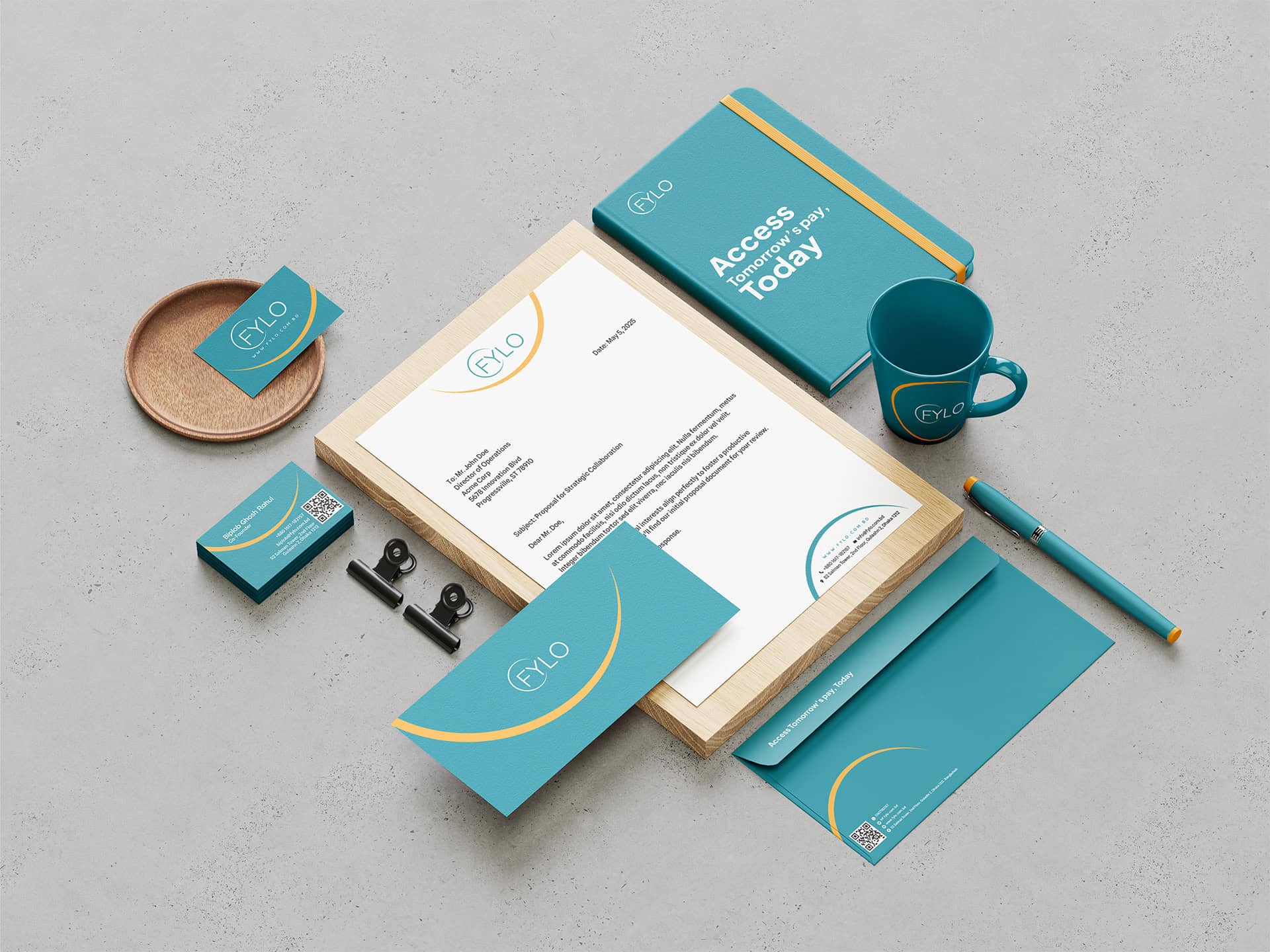
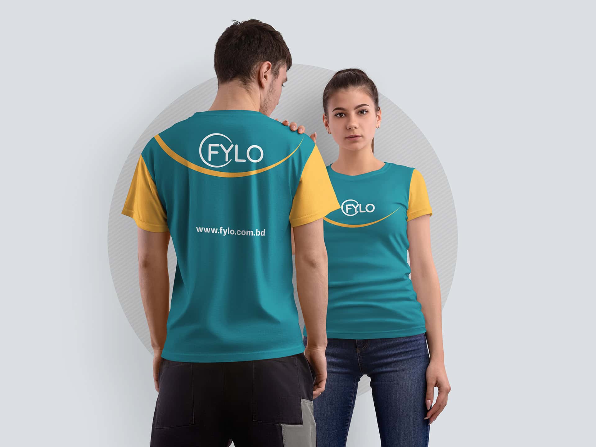
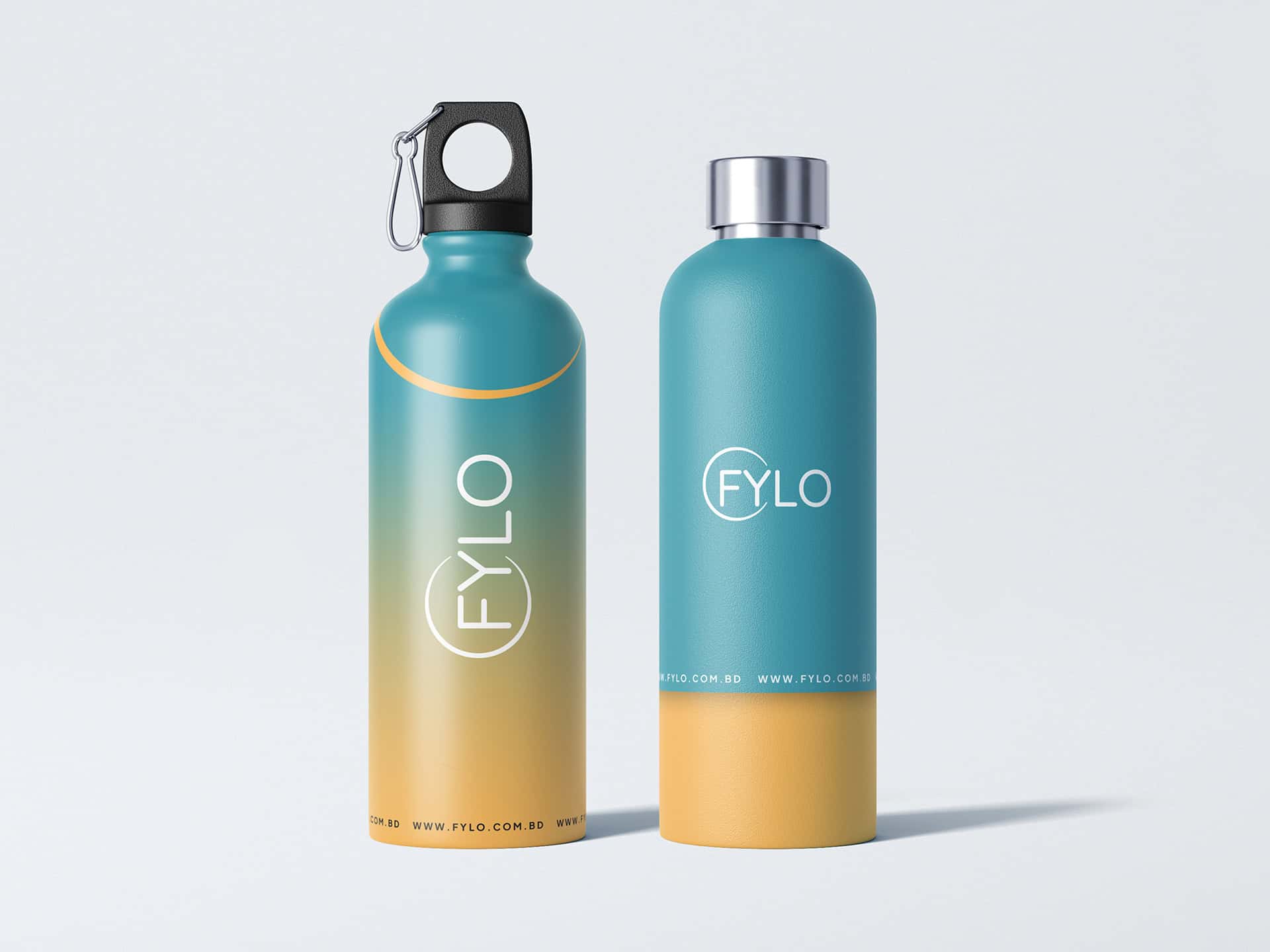
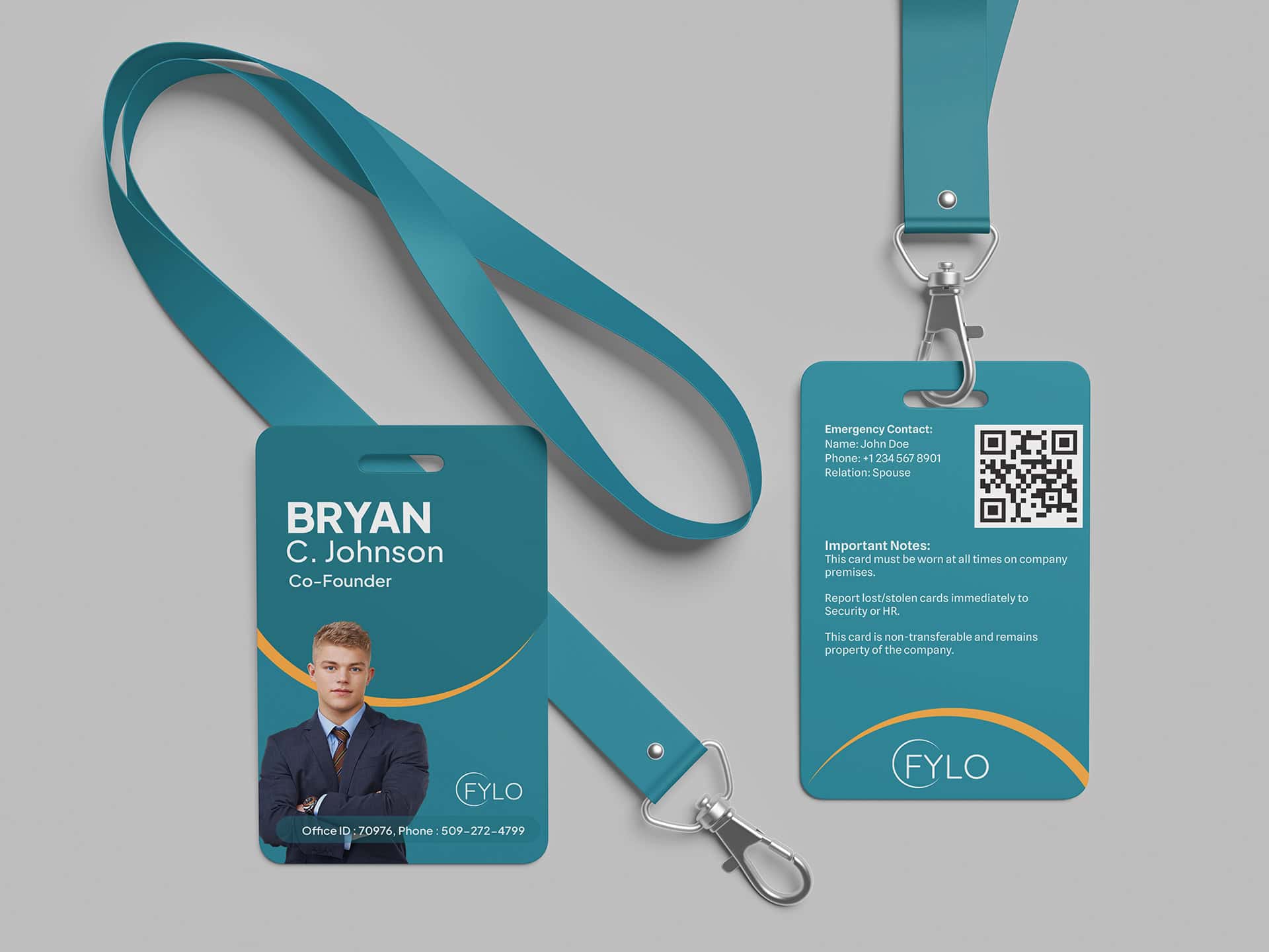
Brand Identity Development
Refining the Visual Foundation
While they had a logo concept, it needed work to truly represent their values. I enhanced their existing mark and built a complete identity system around it, focusing on making financial services feel more human and approachable.
The refined logo balances professionalism with warmth-important when you’re asking people to trust you with their financial needs.
Color Palette That Builds Confidence
I chose colors that would feel trustworthy without being cold:
Cerulean Blue (#2C91A3) – The main brand color that suggests reliability and calm Sunbeam Yellow (#FFD766) – An accent that adds optimism and friendliness
This combination helps the app feel more inviting than typical financial interfaces, which tend to stick with boring blues and grays.
Typography for Real People
Selected Plus Jakarta Sans because it’s easy to read on mobile screens and feels friendly without being unprofessional. When people are reading about money, loan terms, or payment schedules, clarity is everything.
Mobile App Design
Designing for Real Life
I designed every screen thinking about how people actually use financial apps. They’re often multitasking, maybe stressed about money, possibly using their phone in less-than-ideal conditions. The interface needed to work for all of these scenarios.
Making Complex Things Simple
Financial services involve a lot of moving parts, but users don’t need to see all that complexity. I focused on:
- Clear visual hierarchy – The most important information always stands out
- Obvious next steps – Users never have to guess what to do next
- Friendly language – No confusing financial jargon
- Visual feedback – Every action gets a clear response
Mobile-First Thinking
Since this is primarily a mobile app, I designed specifically for how people hold and use their phones:
- Touch targets that are easy to hit, even if your hands aren’t steady
- High contrast that works in bright sunlight or dim lighting
- Quick access to the most common tasks
- Smooth performance even on older devices
Component Library & Documentation
Building for Development
I organized all UI components and patterns in a structured way to help the development team implement the designs consistently. This included:
- Button variations and interactive states for different actions
- Input fields optimized for various types of user information
- Color guidelines and visual hierarchy standards
- Typography usage and spacing specifications
- Icon library and visual assets
Developer Handoff
Everything was organized in Figma with detailed specifications, making implementation straightforward for the development team. I provided interaction details, precise measurements, and clear notes about user experience requirements.
Results & Impact
What We Achieved
The complete visual identity gave this startup a professional presence they could use with investors, partners, and users. The mobile app design provided a clear development roadmap with all necessary specifications and documentation.
Key Deliverables:
- Refined logo and complete brand guidelines
- 35+ mobile app screens covering all user journeys including purchases, cash-outs, and user-to-user transfers
- Organized component library for consistent implementation
- Developer-ready specifications and handoff documentation
User-Centered Approach
Every design decision came back to one question: “Will this make someone feel more confident about their financial decisions?” The friendly brand personality and clear interface design work together to reduce the anxiety that often comes with financial apps.
What I Learned
Working on financial products taught me that good design is about more than just looking nice-it’s about building trust. When people are making decisions about money, especially in stressful situations, every visual detail matters.
The brand identity and user experience had to work together seamlessly. You can’t have a warm, approachable brand but then design interfaces that feel cold and corporate. Everything needs to support the same feeling of trustworthiness and clarity.
Most importantly, I learned to always design with empathy. The people using this app aren’t just completing tasks-they’re often dealing with financial stress and need tools that actually help rather than add to their worries.