UX/UI for a Fintech App Transforming Money Transfers
This Singapore-based fintech app serves migrant workers sending money home. The existing app worked but frustrated users during critical moments—onboarding and transfers. Many gave up halfway through. I redesigned the experience to be intuitive for users with low digital literacy and unstable internet.

- Platform: Mobile App (iOS & Android), Design System
- Project: UX Research, UX/UI Redesign, Design System, Cross-Team Collaboration
- Goal: Simplify onboarding and transfers for low-tech users while reducing errors
- Results: 27% fewer onboarding drop-offs, 34% more repeat transfers
Role & Responsibilities
My Role: Product Designer & UX/UI Lead
I led the complete UX overhaul working with business stakeholders, developers, and researchers:
- Conducted field research with migrant workers across Southeast Asia
- Redesigned critical user flows from scratch
- Built a scalable design system with dev documentation
- Collaborated with marketing on brand alignment
- Reduced friction through simplified, trust-building UX patterns
The Real Challenge
Here’s what was happening:
For Users:
- 6-step onboarding felt overwhelming
- Transfer flows created anxiety about losing money
- Poor connectivity made complex interfaces unusable
- Language barriers caused confusion at critical moments
For Business:
- High drop-off rates during onboarding
- Support overwhelmed with “failed transaction” tickets
- Slow feature development without design consistency
- New users didn’t return after first experience
The breaking point? Users were abandoning transfers mid-flow because they lost confidence the money would reach their families.
My Research Approach
Getting Real Insights
I spent time in dormitories, construction sites, and remittance centers talking to actual users. No conference rooms or surveys-real conversations with people sending money home.
Key Discoveries:
- Users needed constant reassurance during money transfers
- Many had never used banking apps before
- Speed mattered more than fancy animations
- Visual confirmation was crucial (“Is this really going to my mom?”)
Understanding the Stakes
For these users, sending money isn’t just a transaction-it’s supporting family back home. Any confusion or error has real consequences.
Design Solutions That Worked
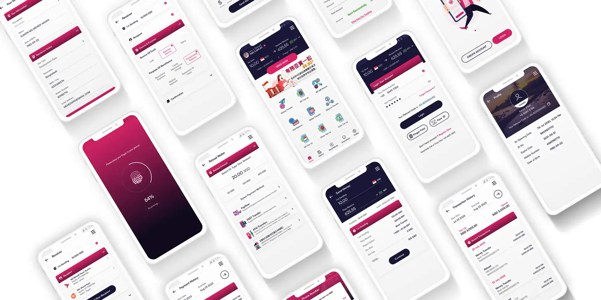
Simplified Onboarding
Cut the sign-up from 6 steps to 3 by removing unnecessary fields and using smart defaults. Added progress indicators so users knew how much was left.
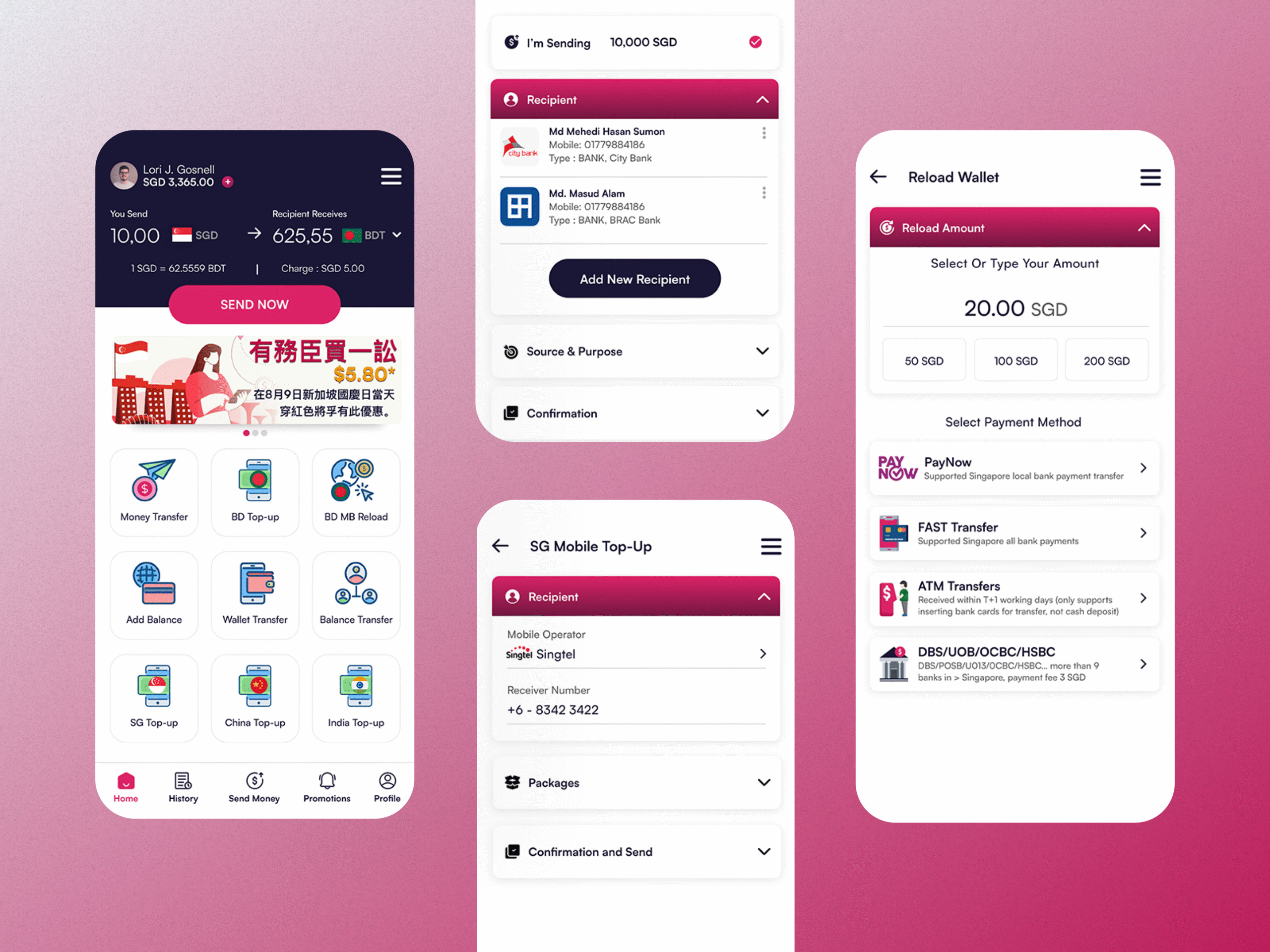
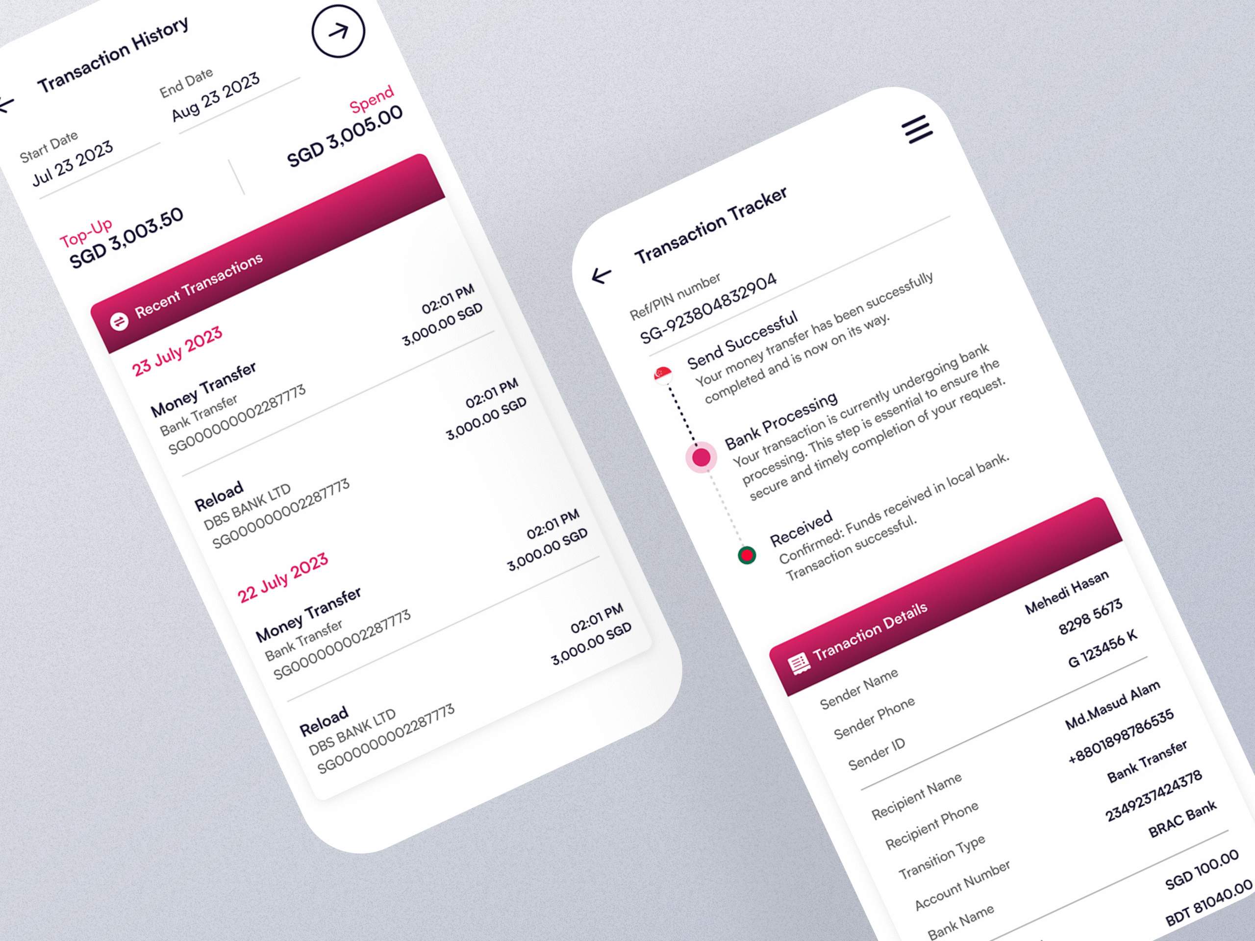
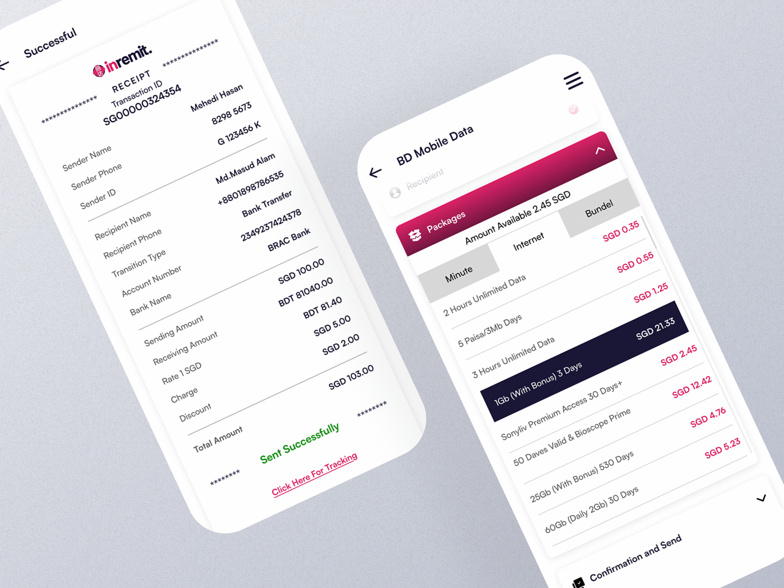
Visual Transfer Flow
Created a transfer interface that shows:
- Recipient’s photo and details prominently
- Live exchange rates with country flags
- Clear “Your family will receive exactly…” confirmation
- Step-by-step visual progress
Smart Repeat Transfers
Since most users send to the same people regularly, I prioritized repeat transaction patterns with one-tap options for frequent recipients.
Design System That Scales
Colors:
- Primary (#DC2368) – Dogwood Rose for CTAs and trust signals
- Supporting (#191636, #5F5F5F) – Clean hierarchy without distraction
Typography: Satoshi font chosen for clarity across multiple languages and small screens.
Components: Built modular pieces-buttons, cards, alerts-with clear documentation so developers could build features faster.

Testing With Real Users
Prototype Validation
Brought interactive Figma prototypes back to users in the field. Watched them actually try to send money using the new designs.
Key Iterations:
- Increased text size after seeing users squint at screens
- Added more confirmation steps (counterintuitive, but reduced anxiety)
- Simplified language and removed financial jargon
- Made buttons bigger for users with work-worn hands
The “Aha” Moment
When a construction worker told me “This feels like texting my family, not using a bank,” I knew we’d found the right approach.
Development Collaboration
Working with the dev team, I created:
- Component specifications with exact spacing and behavior
- Interaction guidelines for different connection speeds
- Fallback states for when things go wrong
- Documentation that non-designers could actually use
The design system wasn’t just pretty-it was practical for a team building fast.
Results That Changed Lives
The Numbers
- 27% reduction in onboarding abandonment
- 34% increase in users making repeat transfers
- Significant drop in support tickets about failed transactions
- Faster development cycles with consistent design patterns
The Real Impact
Users started trusting the app with larger amounts. Families received money faster. Support could focus on real issues instead of UX confusion.
Most importantly? The app started feeling less like a necessary evil and more like a helpful tool.
What This Project Taught Me
User research isn’t optional. You can’t design financial products for vulnerable users without understanding their real context and fears.
Simple isn’t easy. Making complex financial flows feel simple required deep understanding of both technology constraints and human psychology.
Design systems pay off. The upfront investment in components and documentation enabled the team to ship features 3x faster.
Technical Approach
- Research: Field interviews, usability testing, behavioral analysis
- Design: Figma prototyping, component libraries, developer handoff specs
- Testing: Multi-device validation, connection speed testing, accessibility checks
- Implementation: React Native components, responsive patterns, offline states