Website Redesign for Bangladesh’s Leading ISP: From Chaos to Clarity
When Carnival Internet approached me in 2023, they had a big problem. As one of Bangladesh’s largest internet providers with over 500,000 customers, their website was driving people away instead of helping them. Customers couldn’t find what they needed, support tickets were piling up, and the whole digital experience felt outdated and confusing.
They needed someone to completely rethink their web presence—not just make it look better, but make it actually work for their users and business goals.

- Platform: Lead UX/UI Designer & Frontend Developer
- Goal: Transform a confusing website into a self-service platform that reduces support load and increases conversions
- Results: 35% reduction in support tickets, improved conversion rates, increased package upgrades, boosted organic traffic
- Status: Live and continuously evolving
Role & Responsibilities
I served as Design Head and UX/UI Lead, responsible for the complete digital transformation strategy. Working with development, marketing, and creative teams, I oversaw every aspect of the redesign process:
- Leading the full redesign of main website and self-care platform
- Conducting user research and analytics-driven UX audits
- Creating wireframes, prototypes, and high-fidelity designs
- Coordinating with third-party teams for branding and marketing content
- Overseeing frontend development with HTML, CSS, and JavaScript
My previous experience with complex web platforms helped me tackle the unique challenges of serving hundreds of thousands of users across different service tiers.
The Challenge
The original website was failing both users and business. Navigation made no sense, package information was impossible to compare, and simple tasks like paying bills required calling customer service. 75% of visits were existing customers trying to manage their accounts, but the website forced them to contact support instead.
Key Problems:
- Confusing navigation and cluttered mobile interfaces
- No clear path from interest to purchase
- Support team overwhelmed with questions the website should answer
- Potential customers leaving without exploring packages
My Design Process
I started by analyzing four years of analytics data and user feedback. The biggest insight: visitors fell into two clear categories-existing customers managing accounts, and potential customers checking coverage availability.
I redesigned the entire experience around what people actually wanted to do:
- Check coverage – “Can I get service here?”
- Browse packages – “What are my options?”
- Sign up – “How do I get started?”
- Manage account – “Where do I pay bills and get help?”
This became the foundation for restructuring everything from navigation to page layouts.
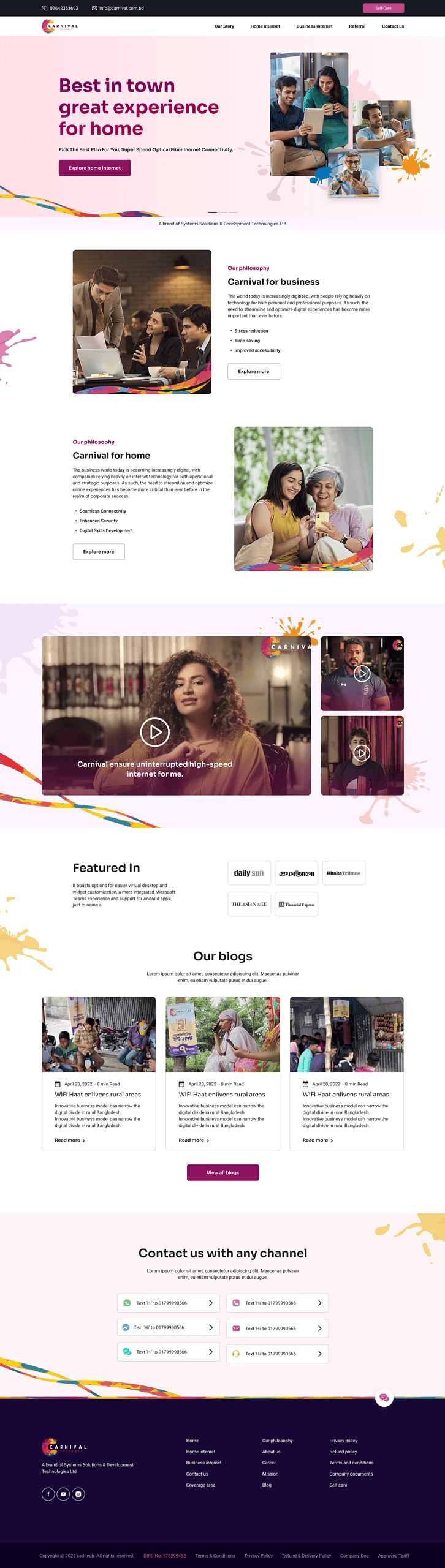
Website Transformation: Before & After
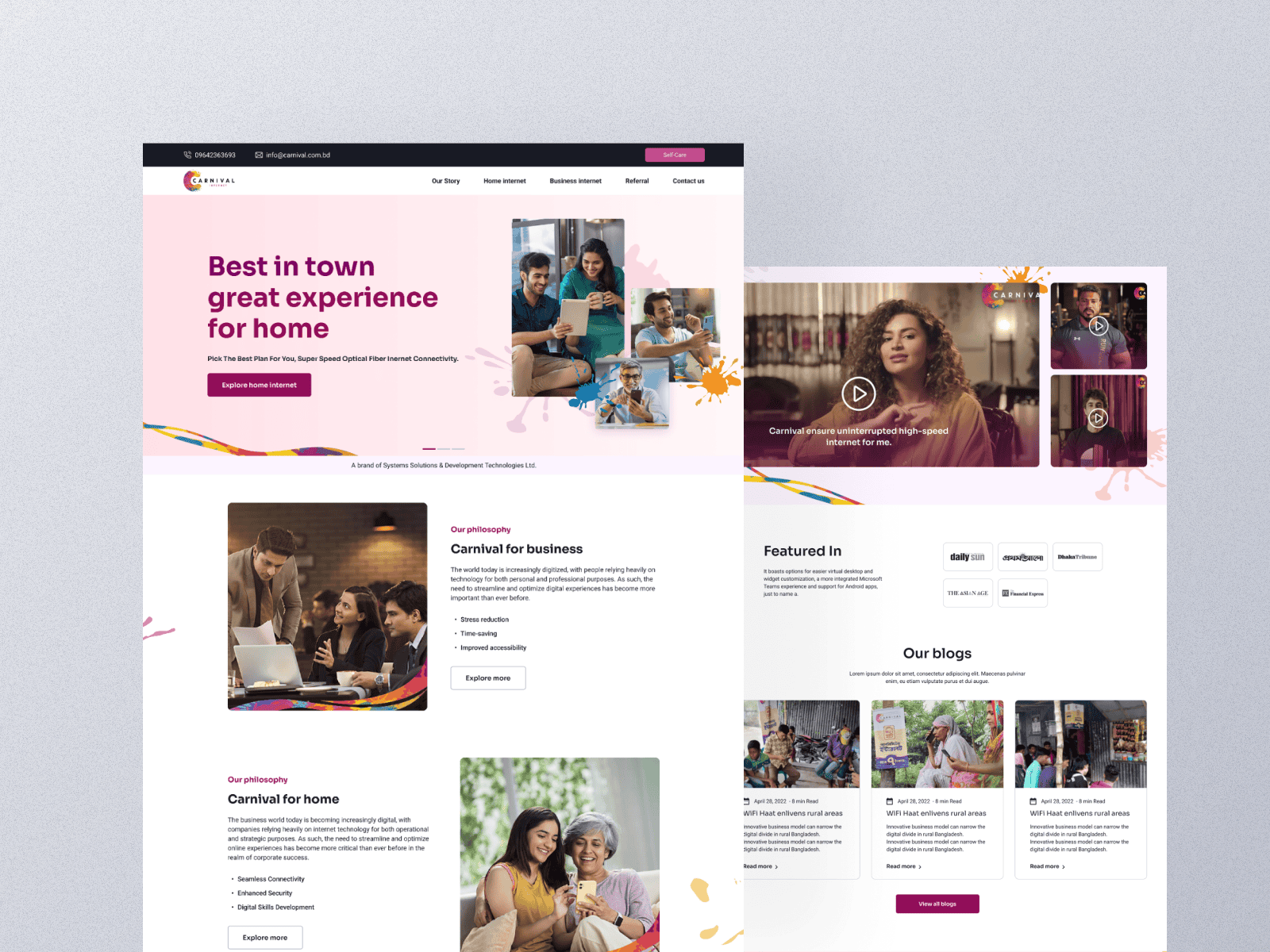
Navigation: From Overwhelming to Obvious
Simplified navigation to focus on the three most-used actions based on analytics data. Made it fixed-position and user-goal focused instead of showing every possible page.
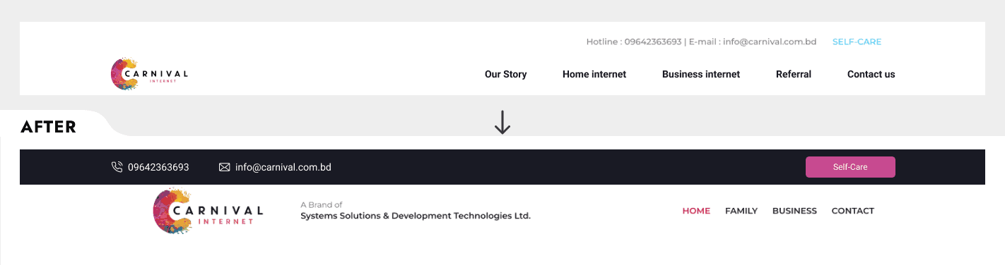
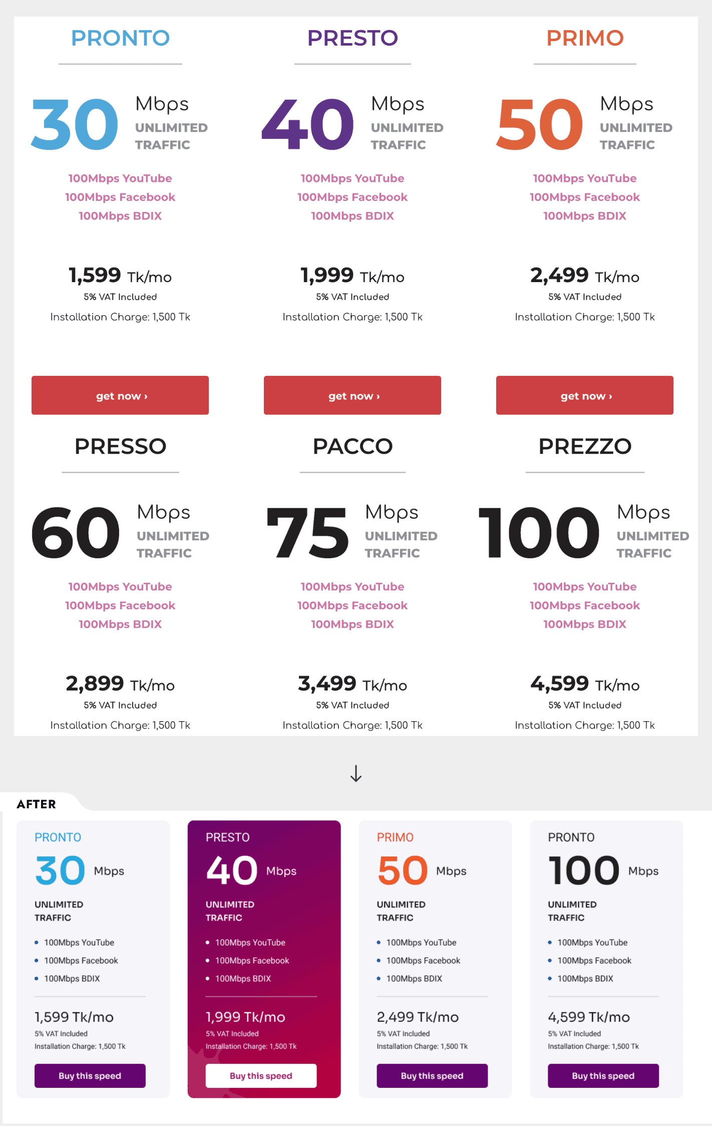
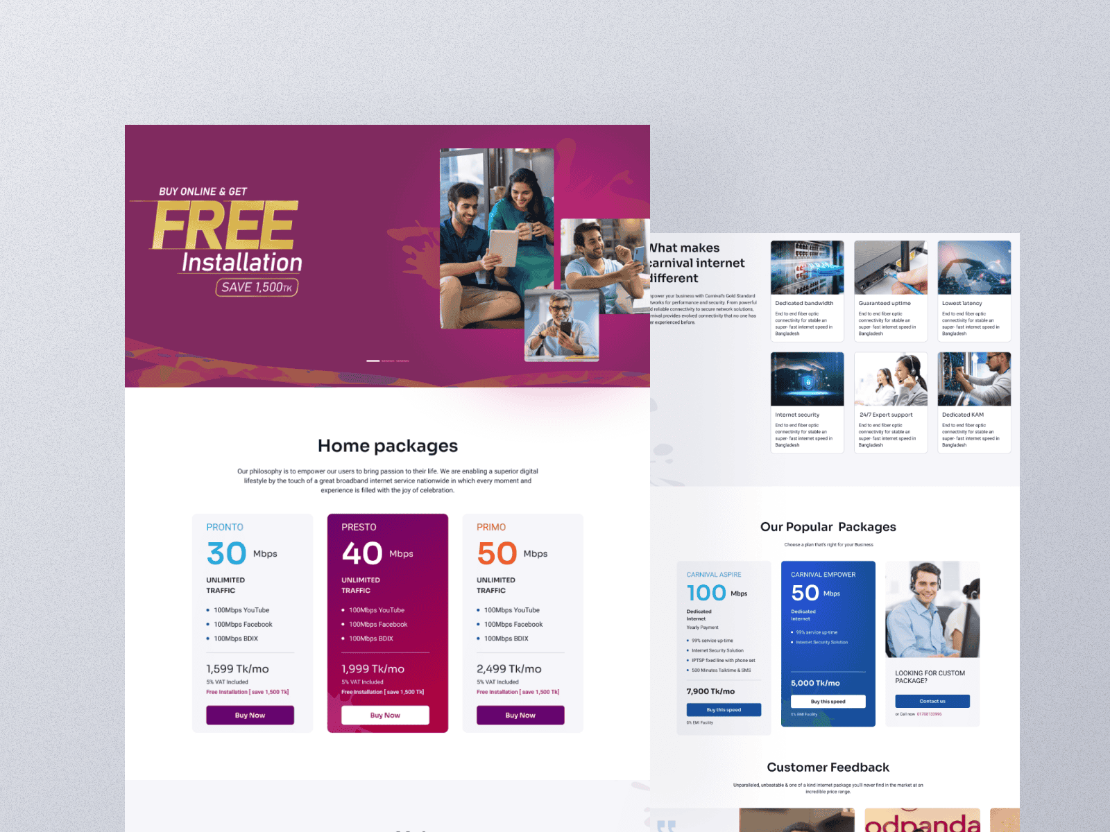
Homepage & Package Selection: Clear Choices
Replaced cluttered sliders with clean messaging and transformed confusing package grids into easy comparison layouts. Added package selection assistance to guide users to the right choice.
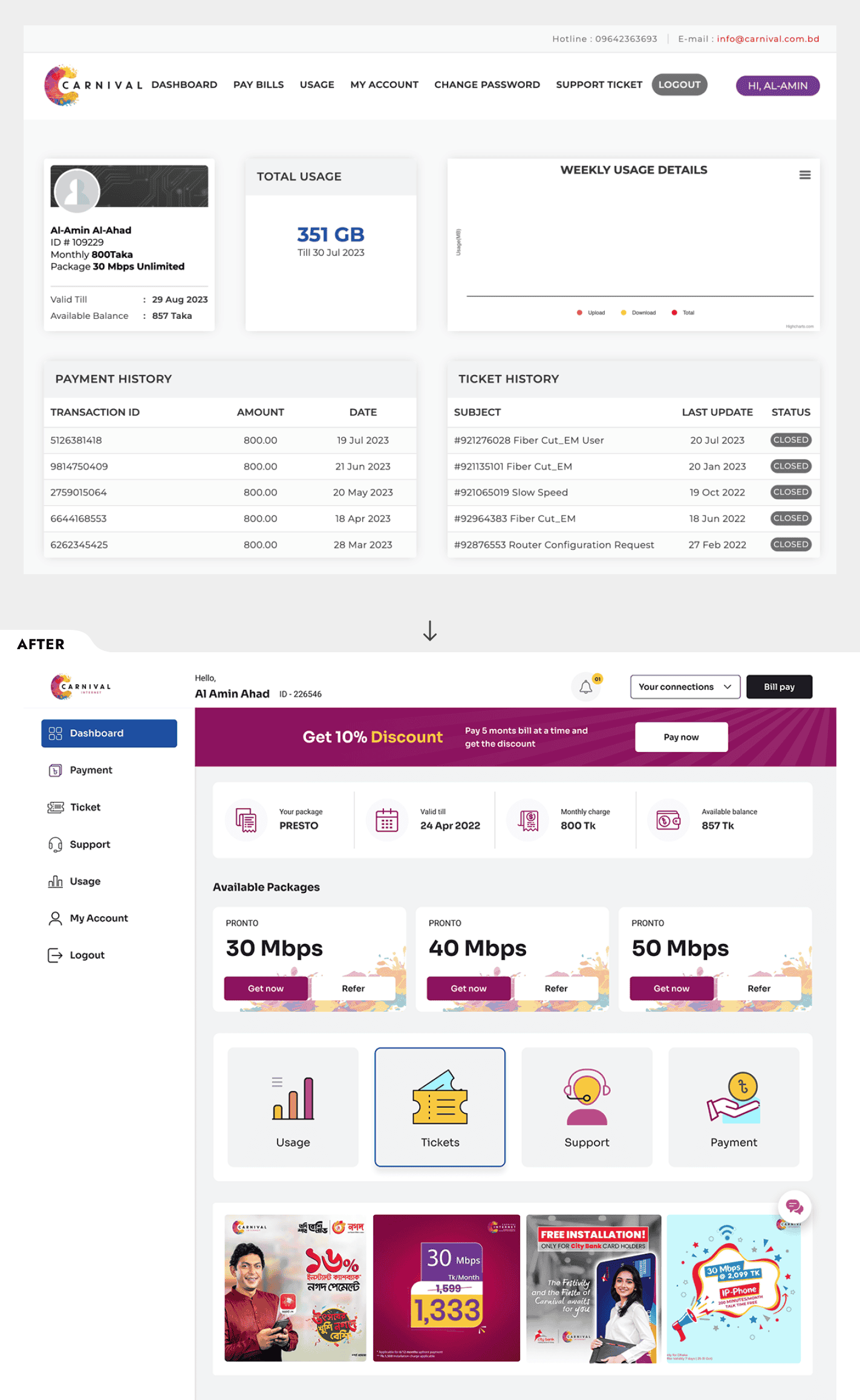
Self-Care Dashboard: Empowering Self-Service
Redesigned the account management area to put all essential information and actions upfront. Users can now pay bills, check usage, and get support without hunting through menus.
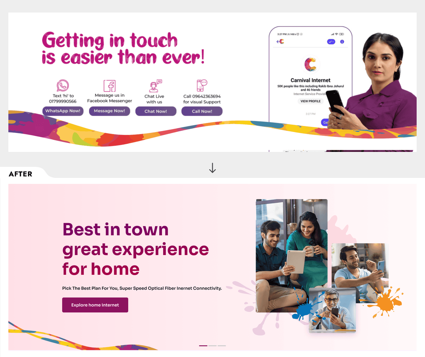
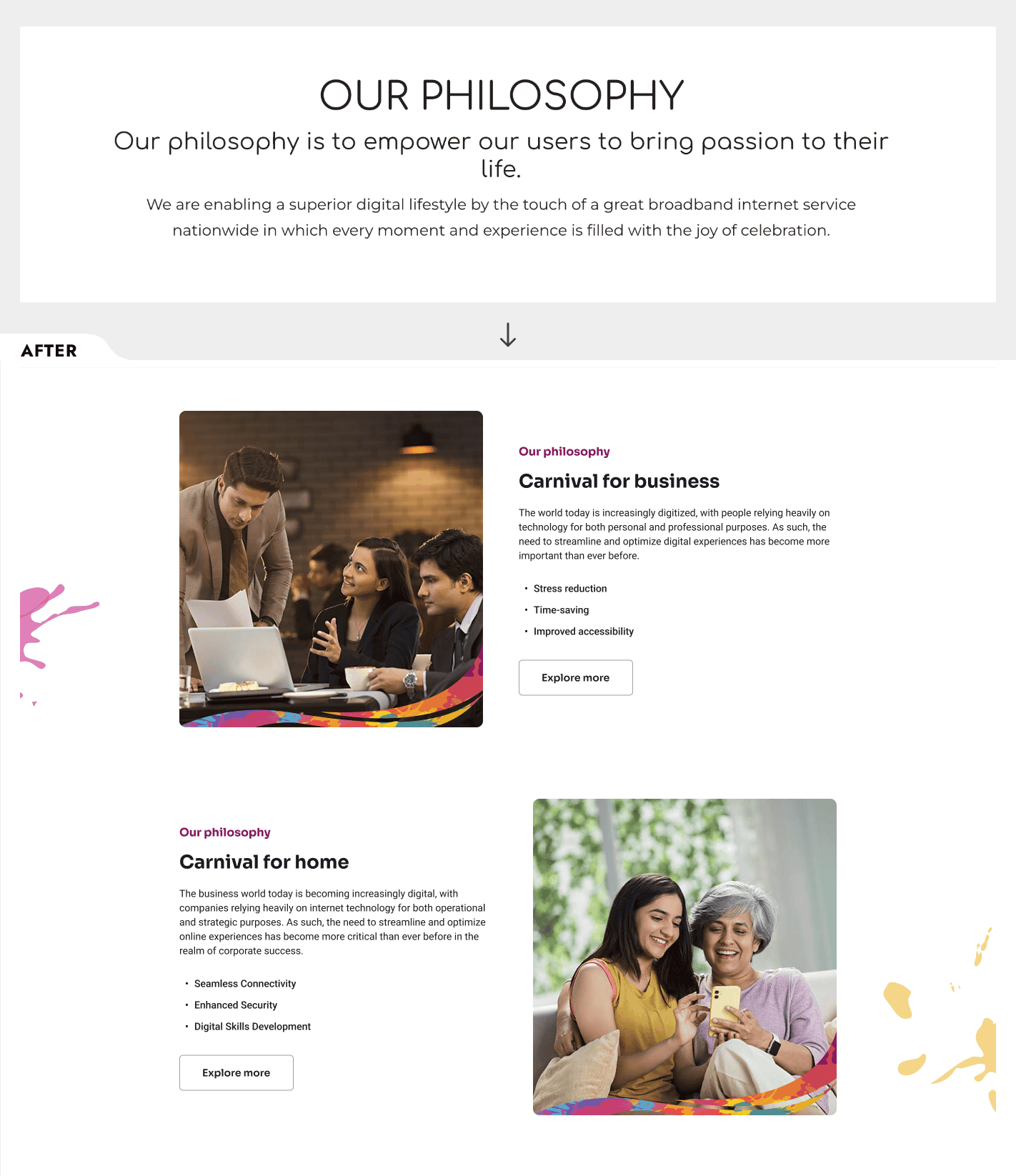
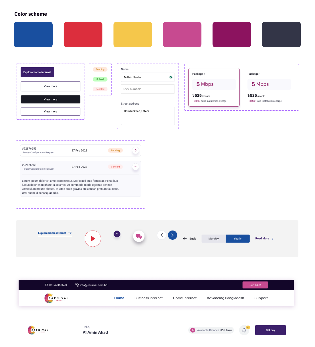
Visual Design & System
I developed two distinct color palettes for home and business users while maintaining brand consistency. The new typography prioritizes readability on mobile devices, especially for billing information and package details.
Built a modular component system that keeps the experience consistent while making it easy for the team to add seasonal campaigns and new features.
Results & Impact
The redesigned website transformed from a cost center into a business asset:
- 35% reduction in support tickets as users complete tasks independently
- Increased package upgrades through clearer dashboard design
- Higher conversion rates from improved purchase flows
- Better SEO performance from UX improvements and content integration
- Longer session duration as users can actually find what they need
Customer service can now focus on complex issues instead of answering basic questions, while more potential customers successfully navigate the purchase process.
Key Takeaway
Redesigning for 500,000+ users taught me that good design isn’t about looking pretty—it’s about solving real problems. Every design decision had to be justified by user data and business impact.
The most important lesson: users don’t care about your internal processes. They have specific goals, and your job is to help them achieve those goals as easily as possible. When you do that well, everyone wins—users get what they need, and businesses see better results.