Visual IVR for Migrant Workers – Bridging Digital Divides
Designing financial services for Bangladeshi migrants in Malaysia who needed banking without barriers.
When your users have basic phones, limited internet, low literacy levels, and can’t install apps—how do you create meaningful digital experiences?
This project challenged everything I knew about UX design and taught me that empathy isn’t just a buzzword—it’s essential.

- Platform: Mobile Web & Voice Integration
- Project: Complete service design, branding, UX/UI, content strategy, and accessibility optimization
- Goal: Create app-like experiences through web browsers for users with basic devices and limited tech literacy
- Results: 32% increase in service adoption, 30% reduction in customer complaints, 6.5% boost in cross-service usage
My Role & What Made This Personal
Lead Product Designer tackling one of the most challenging UX problems I’ve encountered. This wasn’t about making things pretty—it was about creating digital access for people who traditional fintech ignores.
Key responsibilities:
- User research with migrant workers in Malaysia
- End-to-end service design and implementation
- Team management and vendor coordination
- Accessibility-first design for basic devices
Working with migrants who reminded me why design matters beyond Silicon Valley taught me that constraints can spark the most creative solutions.
The Human Challenge
Picture this: You’re working in Malaysia, sending money home to Bangladesh. You have a basic Android phone, slow internet, limited data, and apps feel intimidating. Traditional banking is expensive and complicated.
What I discovered through field research:
- Most users had never used mobile banking apps
- Data costs were a real concern-every MB mattered
- Bangla language support was non-negotiable
- Visual icons worked better than text
- Trust was earned through familiarity, not fancy features
How I Approached the Problem
Research That Opened My Eyes
I spent time with actual migrant workers in Malaysia. Watched them interact with their phones. Learned about their daily struggles, not just their digital habits. Their feedback wasn’t just data-it was stories of families depending on these transactions.
Designing for Reality, Not Ideals
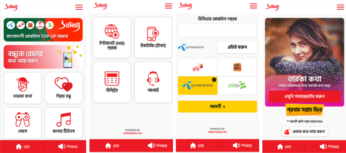
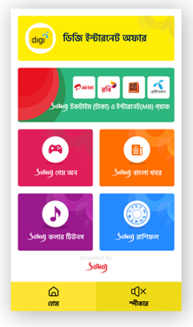
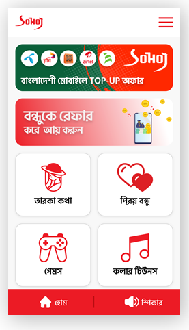
No App Downloads: Everything had to work through a simple web link Visual-First: Icons and images over text wherever possible Lightning Fast: Optimized for 2G speeds and basic devices Bangla-Centric: Language wasn’t just translation-it was cultural understanding
Testing What Actually Mattered
Ran field tests with real users, not lab scenarios. Used simple surveys with visuals because traditional UX testing methods didn’t work for this audience.
What users told me:
- 70% didn’t like my initial design (humbling!)
- 65% preferred consistent box layouts over creative arrangements
- 75% connected with familiar faces in imagery
- 60% preferred darker colors (easier on their eyes and batteries)
The Reality Check: Survey Results
0% said No
0% said Yes
0% said Yes
0% preferred Boxes
0% said Yes
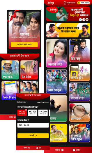
Design Evolution: What Users Wanted vs. What Launched
MVP Version: Basic functionality, minimal design
User-Preferred Version: Dark theme, familiar imagery, structured layouts-users loved this
Final Live Version: Had to compromise due to telco partner requirements and vendor policies
This taught me the hardest UX lesson: the best user experience isn’t always viable due to business realities.
The Design Evolution
MVP Version
User-Favored Version
Final Live Version
| Feature | MVP Version | User-Favored Version | Final Live Version |
|---|---|---|---|
| Branding | ❌ | ❌ | ✅ |
| Cross Product Integration | ❌ | ❌ | ✅ |
| Partner Requirements Met | ❌ | ❌ | ✅ |
| Advanced Menu | ✅ | ✅ | ✅ |
Results
+32%Increase in service acquisition30%Decrease in customer complaints+6.5%Cross-service engagement
What Users Actually Get
One-Link Access: Send money, check news, download ringtones, get horoscopes-all through a single shared link
No Barriers: No app store visits, no registration hassles, no complex navigation
Cultural Relevance: Bangla content, familiar imagery, services that matter to their daily lives
Trust Building: Simple, predictable interactions that don’t intimidate or confuse
The Technical Magic Behind Simplicity
Created a component-based system that felt like an app but ran in any browser:
- Lightweight assets optimized for slow connections
- Touch-first navigation designed for basic touchscreens
- Modular components that could scale across different telco partners
- Offline-ready elements that worked even with poor connectivity
Real Impact on Real Lives
32% more people started using digital financial services-many for the first time
30% fewer complaints because the interface actually made sense to users
Cross-service adoption up 6.5% as people gained confidence with digital tools
But the real impact? Messages from users saying they could finally send money home easily, or check news from Bangladesh during their lunch breaks.
What This Project Taught Me
Designing for underserved populations isn’t about dumbing things down-it’s about being genuinely inclusive. Every design decision had real consequences for people trying to support families thousands of miles away.
Key insights:
- Empathy requires actual conversation, not assumptions
- Constraints can spark the most creative solutions
- User feedback isn’t always actionable due to business realities
- Cultural sensitivity goes deeper than translation
- Sometimes the most impactful UX work happens outside trendy app categories
This project redefined how I approach inclusive design and reinforced why understanding your users’ actual context—not just their user journey—is crucial for meaningful innovation.