
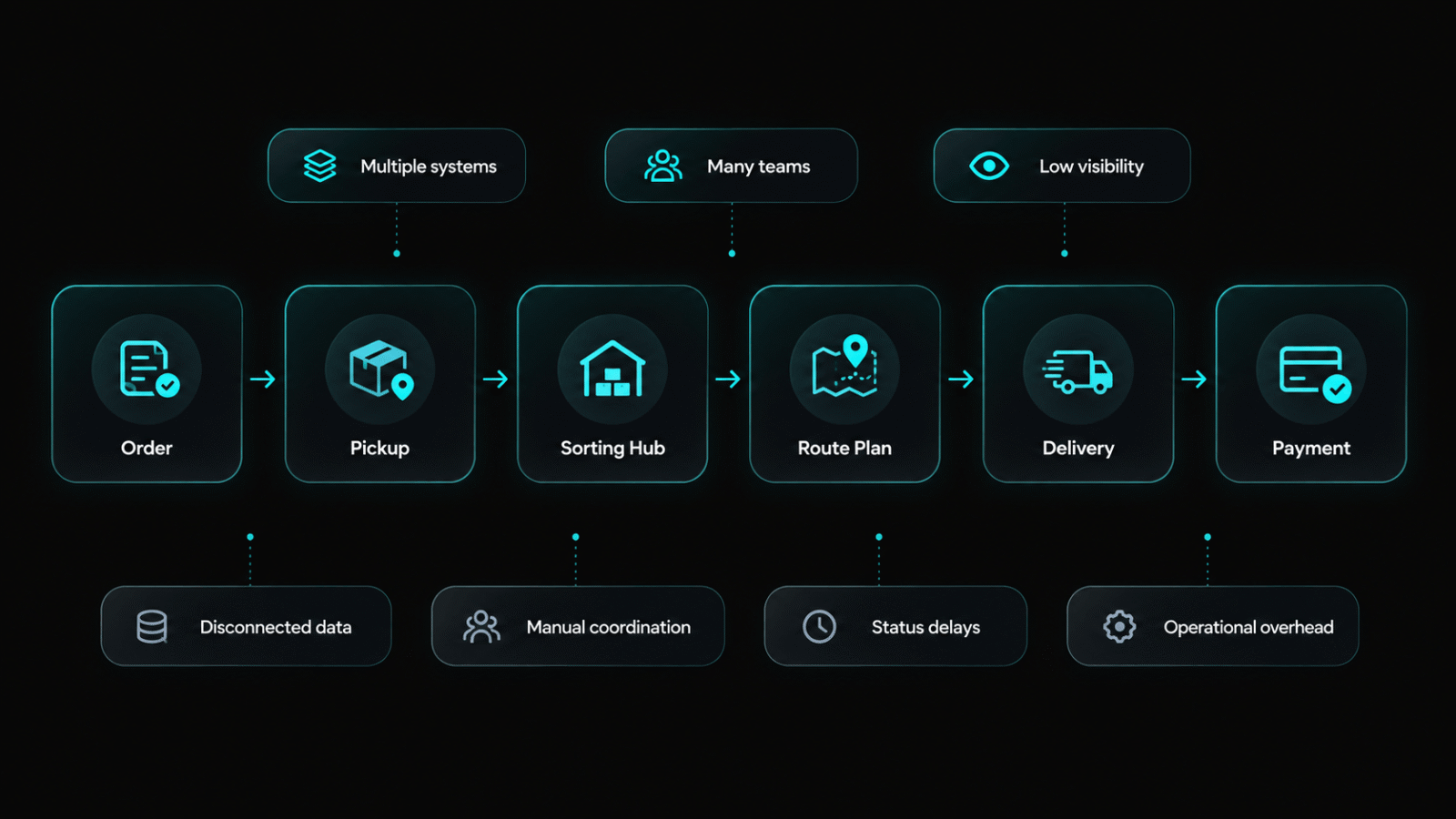
eCourier was already the market leader in Bangladesh, but its digital products had not kept pace with its operational scale. The website was primarily a parcel tracker with little service information. There were no dedicated apps for merchants or agents, which meant both groups were managing logistics through workflows that were never designed for them. Customer-facing and business-facing needs had been treated as the same problem, which they were not. Merchants needed to onboard quickly, manage bookings in bulk, and track commercial volumes. Agents needed task management tools built around field operations. Designing for both groups simultaneously, within a codebase and database structure that was already large and established, defined the constraints of the entire engagement.
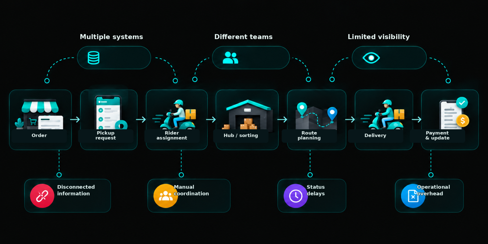
The project was structured around three distinct user groups from the start, customers, merchants, and agents, each mapped separately before any interface work began. User interviews and operational feedback identified where the existing platform created the most friction: merchant onboarding was long and confusing, agent task management had no dedicated tooling, and the customer-facing experience provided tracking information without meaningful service context. Each group got its own defined journey. The design system was built to be modular from the beginning, anticipating that features would be added continuously over a multi-year engagement rather than delivered as a single release.
Key Decisions
Different Tools for Each Role
Merchant and agent experiences were designed as separate product surfaces from the outset, despite pressure to unify them into a single portal. The operational needs of the two groups were different enough that a shared interface would have compromised both. Keeping them separate added initial complexity but prevented the compounding usability debt that a compromised unified approach would have created.

Make Requirements Clear Upfront
The merchant onboarding flow was broken into compliance-aware steps with government and company policy requirements surfaced upfront rather than mid-process. The original flow asked merchants to produce documents they didn't know they needed until they were already partway through signup. Restructuring the information sequence produced a 19% increase in completed merchant onboarding.
Build a Modular Dashboard
A modular dashboard component system was built in year one and maintained throughout the engagement. As scope expanded, which it did consistently across four years, new features were added as modules rather than requiring structural redesign. This kept the interfaces coherent across a product that grew significantly beyond its original brief.

Keep Design and Build Together
Frontend development was led in parallel with design throughout, not handed off at completion. This allowed performance constraints, particularly around loading speed on slower connections, to be addressed during design rather than after. Task completion speed improved 3x for agent workflows, partly because performance was treated as a design requirement from the start.
faster task completion for agent workflows after dedicated tooling launched
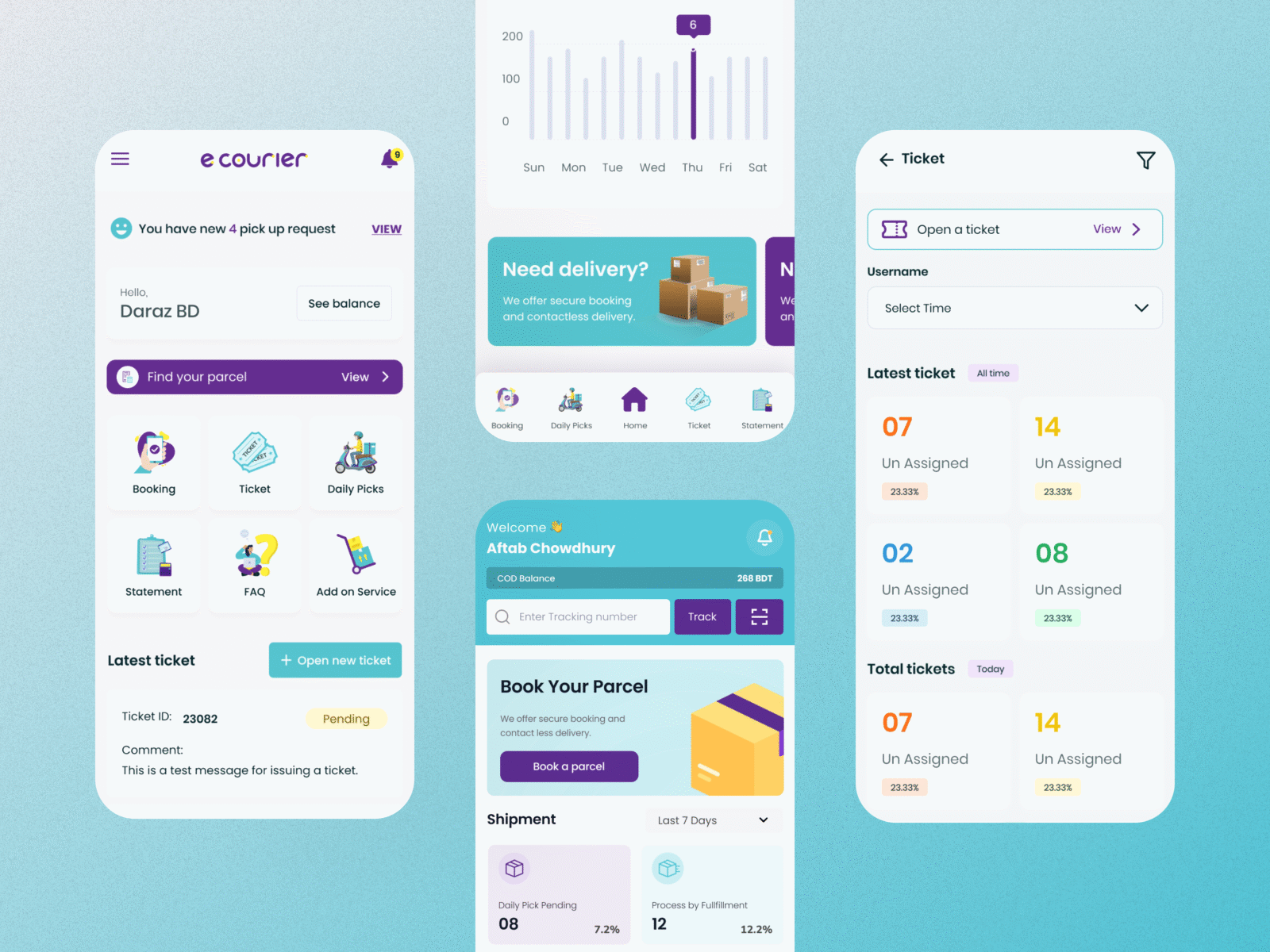
Over four years of continuous design and frontend leadership, eCourier's digital ecosystem was rebuilt across every user-facing surface. Merchant onboarding completions increased by 19% following the restructured signup flow. Agent task completion speed improved by 3x after dedicated operational tooling replaced the previous workarounds. The modular design system scaled across the website, customer app, merchant portal, and agent tools without structural rework, absorbing feature additions that extended well beyond the original project scope. The platform remained coherent across all surfaces throughout an engagement that grew significantly in scale and complexity from its original brief.


The biggest constraint on this project wasn't scope or timeline, it was the existing database structure. By the time design was involved, the data architecture had already been established, and some UX decisions that would have simplified the experience significantly were not available because of how the backend had been built. I would push earlier and more directly for design input during technical planning on any project of this scale. The interface can only be as clear as the data model underneath it allows it to be.